
Why pixel art?
I love pixel art.
I have fond memories of playing Monkey Island, Gahan Wilson’s The Ultimate Haunted House, Day of the Tentacle, Full Throttle, Sam & Max Hit the Road, Simon the Sorcerer and Discworld.
My first foray into digital art was with Microsoft Paint many years ago. I’d try to replicate, pixel for pixel, the characters from screenshots on the back of the game boxes. So I almost feel nostalgic going back to my roots in pixel art.
Box Directive was always going to be pixel art. The original concept drew inspiration from the Apple TV show Severance, and we wanted a retro, Braun-inspired packing office. Pixels just seemed to go hand in hand with the overall theme.
Why an isometric view? (Well, somewhat isometric)
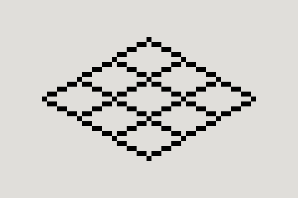
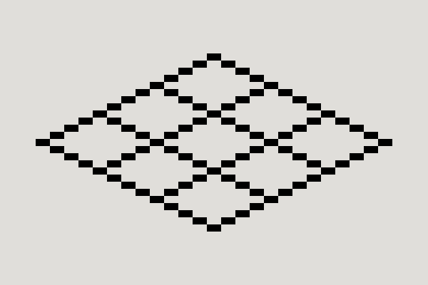
Did you know? In a traditional isometric drawing, the receding axes sit at 30°. Trying to recreate that angle on a square pixel grid can result in jagged, inconsistent-looking lines.
Instead, pixel art commonly uses a 2:1 ratio – two pixels across for every one pixel up or down. Technically, this is closer to a form of dimetric projection than true isometric, but “pixel isometric” is a much easier way of describing it.
Why use it?
Detail – plain and simple.
Isometric allows me to give volume to the designs and gives every object a consistent way to sit within the same space. It also gives me reusable structures to work from, which should help speed up the turnaround of future assets.
What did I underestimate?
Simplicity.
When I started designing assets for Box Directive, I flew brazenly into the sun.
All that excitement went straight into designing boxes and machines, bypassing a lot of the logical steps needed to create a scalable set of assets.
As I was drawing, I started noticing little annoyances that would eventually lead to entire assets needing to be reworked. Things wouldn’t quite line up, highlights would feel weighted towards one side, and something that worked on one object wouldn’t necessarily work on another.
I hadn’t considered how one tiny decision could create a multitude of issues further down the line.
However, each mistake helped shape and define the system. They weren’t wasted work. Instead of repeatedly working through an issue, I started defining the problem, fixing it in a way that could work for future assets, and then moving on.
The tipping point was a corner.
I had originally created the front corner of my boxes using two pixels, but the highlight always felt weighted towards the right-hand side. With two pixels there was no single centre to work from.
Changing the corner from two pixels to three gave me something incredibly useful:
one central pixel.
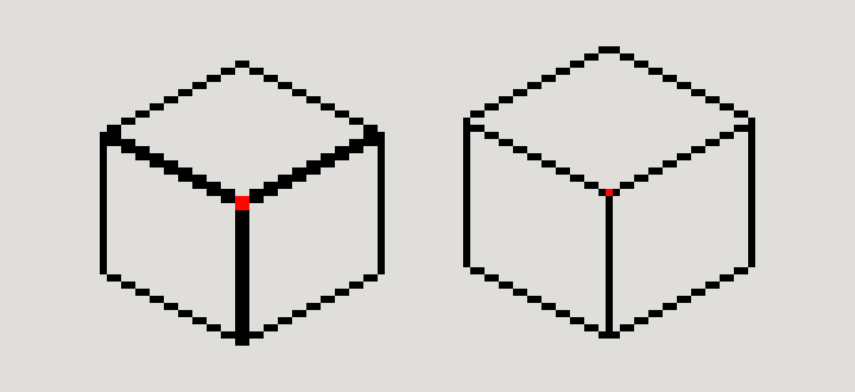
The highlight no longer felt weighted to either side, and I suddenly had an exact point I could build around.
That became my first rule.
Over time, as I started refining the blocks from the blockout, more problems appeared and more rules followed.
The rules
1. The Lazy Susan
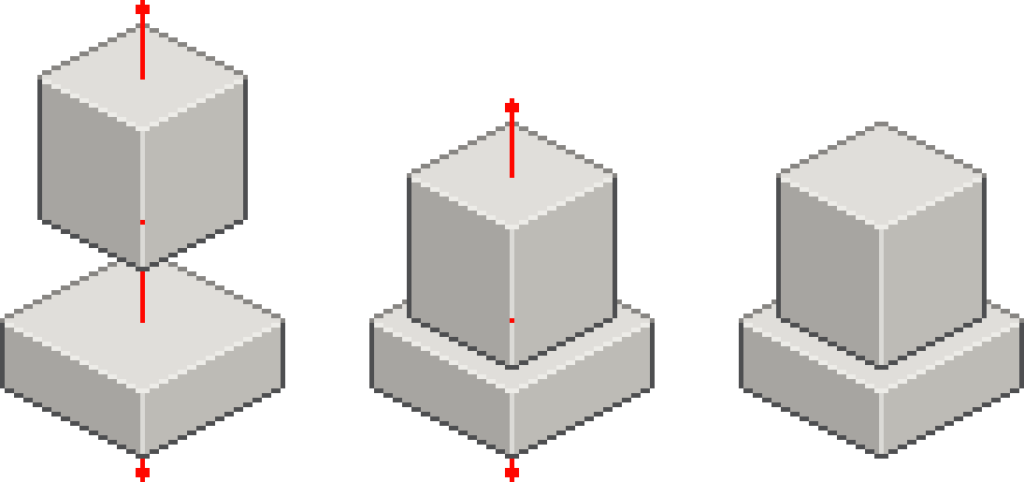
I needed a way to anchor a machine or box to the surface it was sitting on.
I started thinking of every asset as though it were sitting on a Lazy Susan. At the centre of the underside face is a single pixel that acts as its anchor point.
If I ever need to spin or swivel the whole object, this would be its core.
A single point. A single pixel.
This revelation single-handedly changed everything I built after it.
2. The Odd Ones
That single-pixel requirement from the first rule set in motion the calculations that started defining my blocks.
If a dimension needs a true centre, it needs to be odd.
A 40-pixel-wide space has its centre between pixels 20 and 21. A 41-pixel-wide space gives me one single pixel sitting directly in the middle.
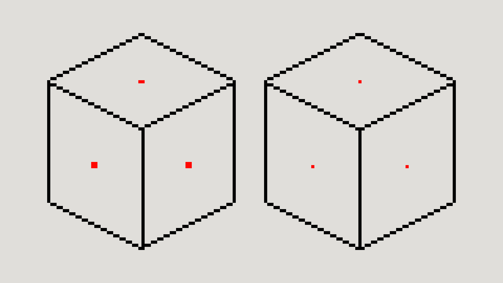
So wherever I need a true centre within my construction system, an even number isn’t going to work.
It seems obvious now, but it wasn’t something I had considered when I first started creating the assets.
3. The Central Six
This rule started off much smaller.
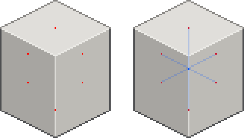
While refining the blocks, I started stacking them on top of one another. I needed a reliable way to centre one block on top of another, so I added a central point to the top face.
Later, I needed a pivot point for the monitor, so I added one to the right face and another to the hidden rear face.
At that point, it just made sense to stop adding them only when I needed them and make it a rule instead:
every block gets a central point on all six faces, whether those faces are visible or not.
4. The True Centre
This was an interesting one.
It started as a way to confirm that all of the other centre points agreed with one another. Following the central points through the block gives me the true centre of the whole object.
I decided to keep it in for potential animation needs later.
I may not need it for every asset, but if I ever do, I already know exactly where it is.
5. The Back-most Point
This one was born entirely from frustration.
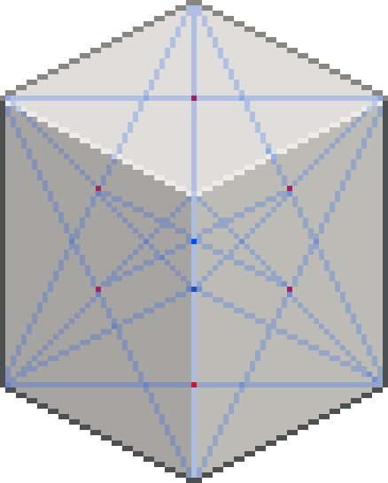
Every time I needed to figure out where the back-most corner of an object would land on the floor – or on another block – I’d have to redraw the hidden edges just to find that one point.
By adding the back-most invisible corner into my blocks from the start, there was no more guessing, drawing and redrawing.
The point is simply there whenever I need it.
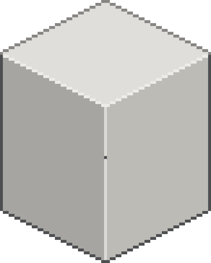
Together, these rules helped define what I needed from each and every block. More importantly, they helped me visualise the assets in 3D space rather than treating them as individual flat sprites.
Putting the rules into practice
Using these rules while refining the computer block from a crude cuboid into a multilayered structure was where I started to see everything click together.
Instead of eyeballing where the monitor should sit on the computer base, I already had central points I could use to align one block with another.
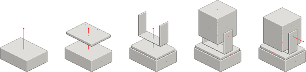
The same rules could then be applied again as more pieces were added.
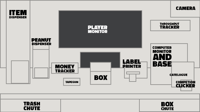
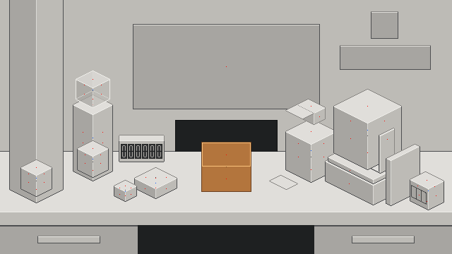
The blockout itself was originally supposed to be nothing more than a quick, deliberately ugly way of working out where everything needed to sit within the scene.
Instead, it exposed a much bigger problem with the way I had originally been creating the artwork and started defining the construction system for everything that came afterwards.
I don’t begrudge diving head-first into asset making. If anything, I needed to make those mistakes to understand what the system actually needed to solve.
Each mistake gave me another problem to define, fix and turn into something reusable.
What’s next?
All this talk about central points, Lazy Susans and swivelling moves me nicely onto the next task – circles.
We have computers, machines and objects that will all need some level of curvature, whether it’s buttons, lights, dials, rolls or simply the overall shape of a machine. I don’t want everything in Box Directive to be square.
Circles are going to become a blocker if I don’t get a handle on them now.
Rather than drawing a new circle every time I need one, I’m working towards a reusable library of isometric circles at different sizes, all following the same central-pixel principles I’ve started establishing for everything else.
There’s still more to learn, more to design and new mistakes waiting to happen.
I’ll keep documenting them as I go.
Continue reading: Art Notes #02: When “Good Enough” Has to Be Good Enough
Comments (0)