

The catalogue came from GARY.
Once we’d started talking about automation and how the player might eventually upgrade him, we ran into a fairly obvious question: how does the worker actually get hold of a robot in the first place?
We could have tied GARY to a skill unlock or a particular story beat, but I liked the idea of him being something the player gradually works towards. By this point we already knew money needed a purpose beyond simply buying consumables, and GARY felt like a good long-term goal. Rather than unlocking the whole robot at once, the player could buy him piece by piece.
That immediately reminded me of the monthly magazines I remember from growing up. You’d get one part of something with each issue, then have to wait until the next month for another piece. I remember wooden dinosaur skeletons being sold like that. The anticipation of waiting to see what came next was part of the appeal.
A mail-order robot catalogue felt like a good fit.
It also happened to line up nicely with how I’d already built GARY. Because he needed to be articulated for animation, I’d designed him as separate parts anyway. Head, body, arms, base and everything else were already individual pieces, so turning those into things the player could purchase separately didn’t require me to rethink the robot.
We could even delay deliveries by a few shifts. The idea at the moment is that you’re not really supposed to be building a robot to do your job for you, so ordering parts could feel slightly against company policy. You place an order, carry on working, and eventually another piece quietly turns up.
There are still plenty of gameplay details to work out, but the catalogue itself now had a reason to exist.
Making it feel like it belonged on the desk
I knew from the beginning that I didn’t want the catalogue lying perfectly flat.
There were already a lot of blocks in the workstation facing the same general direction. I’d broken away from that slightly with the computer monitor, but I wanted the desk itself to start feeling a little less arranged and a little more lived in.
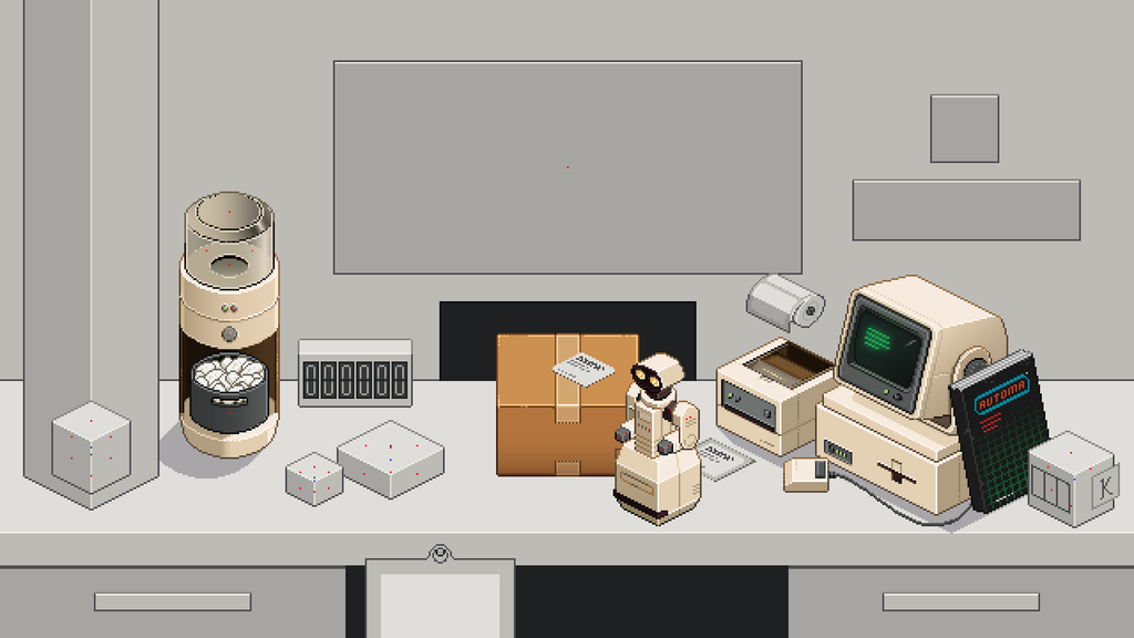
A magazine leaning against the computer felt natural. Something close at hand that the worker might flick through when things slow down, rather than another object placed neatly into the scene because the game needed it to be there.
The original scene already had a simple blockout in roughly the right position, so I started from that. My main concern was the lean. I wanted it obviously propped against the computer, but not leaning so far backwards that it looked like it should be sliding down the desk.
I also wanted the spine to stay a consistent thickness.
I measured the width of the spine and stepped backwards by that same distance a couple of times, effectively giving myself three reference blocks. The original blockout sat on the last one, which gave me a controlled distance to work across instead of just dragging the top of the catalogue backwards until something looked right.
From there I used one of my isometric circles as another guide. I placed its centre on the bottom-left pixel of the spine and used the point where the circle crossed the furthest grid line to help establish where the top of the leaning spine should land.
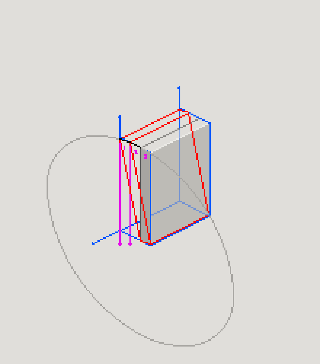
It was similar to some of the thinking I’d used while tilting the computer monitor. The difference here was that the spine was much shorter, so I couldn’t reproduce the step pattern perfectly. I shortened one part by a pixel, looked at it, and it felt right.
That was enough.
I could probably have gone further. I could have found the exact proportions of an A4 catalogue, converted them into pixels and worked out whether the whole thing was dimensionally accurate.
But how far is too far?
At some point the measurements stop helping the artwork. It looked like a catalogue, it felt believable in the scene and the lean worked. I didn’t need to prove that it would survive inspection with a ruler.
A design that didn’t fight back
Most of the assets I’ve made for Box Directive have caused some kind of problem.
The boxes changed shape. The label printer needed rebuilding. The peanut dispenser made me rethink gradients. Even the computer involved a lot of back and forth while I tried to translate several layers of depth into a fairly small number of pixels.
The catalogue didn’t really do any of that.
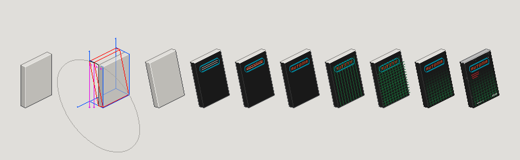
Once the shape was working, the front cover more or less landed on the first attempt.
I didn’t even have a particularly clear reference for it. I was looking around at various bits of old technology and science-fiction imagery, but there wasn’t one specific image where I thought, “that’s the cover”.
I think it came from lots of smaller things I’d absorbed along the way. Black backgrounds, green grids, hard angles, that old idea of what futuristic technology was supposed to look like. Things like Tron or a holodeck-style grid, where you can communicate “technology” very quickly without needing loads of detail.
Black and green were already part of the visual language I’d established with the monitors, so I wasn’t introducing another colour scheme either. It felt like something that could live naturally in the same world.
I tried the cover.
It worked.
That’s about as complicated as that part of the story gets.
It’s actually been quite nice having one asset behave like that. I’m not entirely sure why it worked so quickly. Maybe it’s because a book is a familiar object with a predictable shape. Maybe the construction work I’d already done on other assets made the perspective easier to solve. Maybe I just happened to make the right decisions first time.
Sometimes a design just clicks.
From ANALOG to AUTOMA
There was one thing I did change.
The catalogue was originally called ANALOG. I liked the irony of a catalogue selling automation and robot parts being named after the opposite of digital.
Later, while doing some more research, I came across an old computing magazine using the same name with a visual treatment that felt uncomfortably close to what I’d made.
I couldn’t say for certain whether I’d scrolled past it earlier during research and taken some subconscious inspiration from it, or whether we’d simply arrived at similar ideas independently. Either way, once I’d seen it I didn’t feel comfortable leaving the design as it was.
So the name changed.
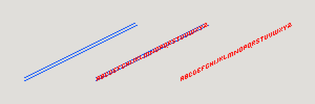
Fortunately, I’d already been experimenting with which letters worked properly when drawn along that 2:1 perspective. Some letters translated surprisingly well, while others really didn’t. That gave me a limited alphabet to work from, and I also wanted the replacement to remain six characters long so I wouldn’t have to redesign the entire masthead.
Eventually I landed on AUTOMA.
In my head, it’s short for Automatic Machine. Whether that ever gets explained to the player doesn’t really matter. It sounds slightly strange, slightly technical and a little bit science-fiction, which is enough for me.
More importantly, it fitted into exactly the same space.
No redesign required.
And then it just fitted
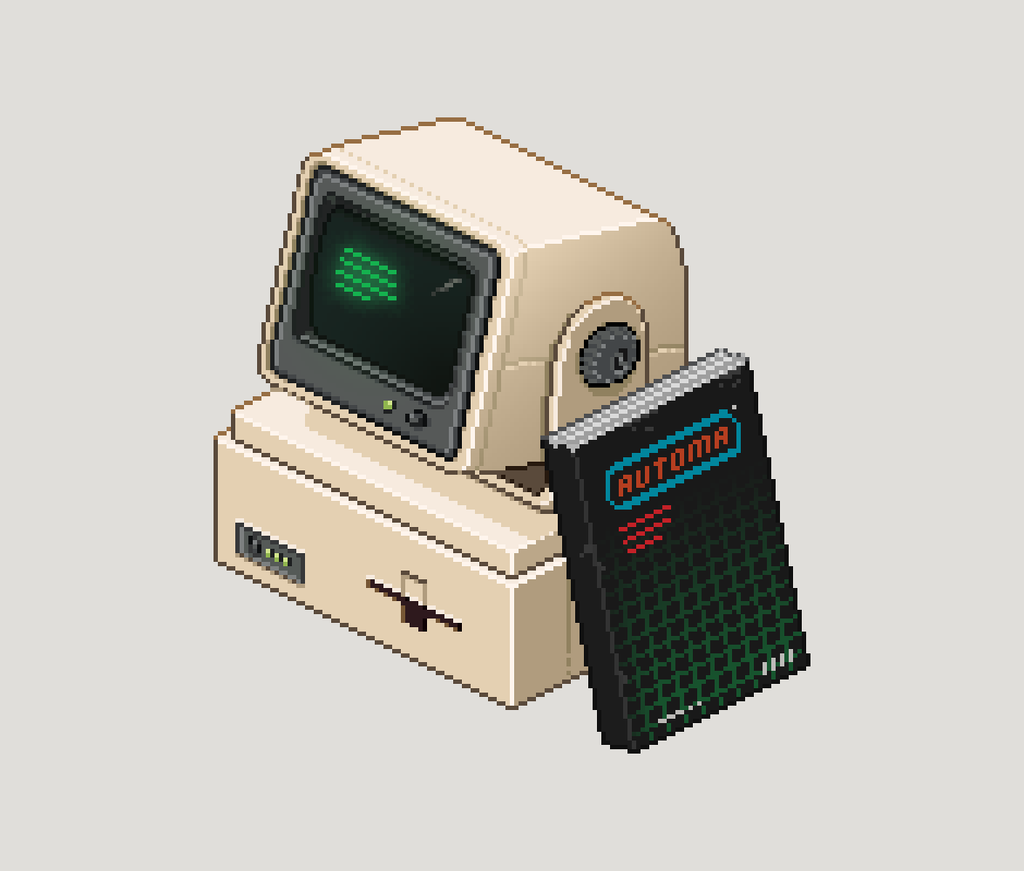
The final test was putting it back into the workstation.
I’d designed it specifically to lean against the computer, so there wasn’t much mystery about where it was going to live. Once I dropped it into the scene, it looked like it had always been there.
That was it.
No second version. No major proportion changes. No moment where I decided I’d taken the whole thing in the wrong direction and needed to rebuild it.
It just fitted.
I’m still exploring what the inside of AUTOMA will eventually look like. I know I want it to feel like an old mail-order catalogue rather than a modern shop interface, but beyond that I haven’t settled on a direction yet. Robot parts, product codes, prices and all the other details can come later once I actually start designing that part of the experience.
For now, the physical catalogue does what I needed it to do. It gives the desk another object that feels like it belongs to the worker, it creates a physical route into buying GARY’s parts, and it breaks up some of the cleaner machine shapes around the computer.
More than anything though, it was just nice to make something that didn’t fight me.
Not every design needs a dramatic problem to solve.
Sometimes you draw something, put it in the scene, and it works.
Comments (0)