
At first, I thought the boxes would be one of the easier assets to create. I’d already designed them once before, so I assumed it would mostly be a case of translating them into the new perspective.
I was wrong.
The original boxes were drawn in a more traditional isometric view. You could see three sides of the box, with those familiar 2:1 stepped lines naturally giving it depth. For the demo, I needed to bring the boxes around into a much straighter view. The silhouette of the box still came through and I understood what I was looking at, but I’d essentially gone from showing three faces of a box to two. I’d lost one of the easiest ways I had of communicating depth.

The biggest problem was the flaps.
I tried drawing them more realistically, thinking about how large the actual flaps of a cardboard box would be. They ended up taking up far too much room on either side. I tried pointing them out at different angles, but something always looked wrong. No matter where I put them, I couldn’t find an angled version I was happy with.

Eventually, mostly out of frustration, I pointed them straight down.
They looked a little like penguin wings, but they worked. The shape added some variation to the otherwise straight edges of the box without making the silhouette too wide. There was also a practical gameplay benefit. Keeping the flaps close to the box gives us more room around it for GARY to move and stops the box encroaching too far into the readable areas of the surrounding machines.
I’m still not completely happy with the flaps. They are very much a compromise, and they’re something I might come back to during the polish stage. Maybe I’ll have another idea by then. Maybe, after drawing hundreds more sprites, I’ll simply be better equipped to solve it.
For now, they’re good enough.
That solved part of the problem, but the boxes still needed more character. They were very straight, very clean and still felt like blocks rather than cardboard.
Some of the solution actually came from something I’d been experimenting with while working on the label printer. Its transparent brown lid had pushed me to think more about how I handled harsh pixel edges. I’d started using intermediary colours almost like manual anti-aliasing, softening certain edges rather than letting everything become another hard line.
While experimenting with the colours, I also started breaking up some of the highlights. It wasn’t originally an attempt to add dents or damage. I just had too many continuous lines and wanted to stop everything feeling so line-heavy.
Then I looked at it and thought, “Oh, okay. That might work.”
Bringing that technique across to the boxes helped enormously. Breaking highlights and shadows stopped every edge from looking perfectly manufactured. I wasn’t intentionally placing a dent here or an imperfection there, but those gaps sometimes gave the illusion of little inconsistencies in the cardboard anyway. The eye fills in more than I’ve actually drawn.
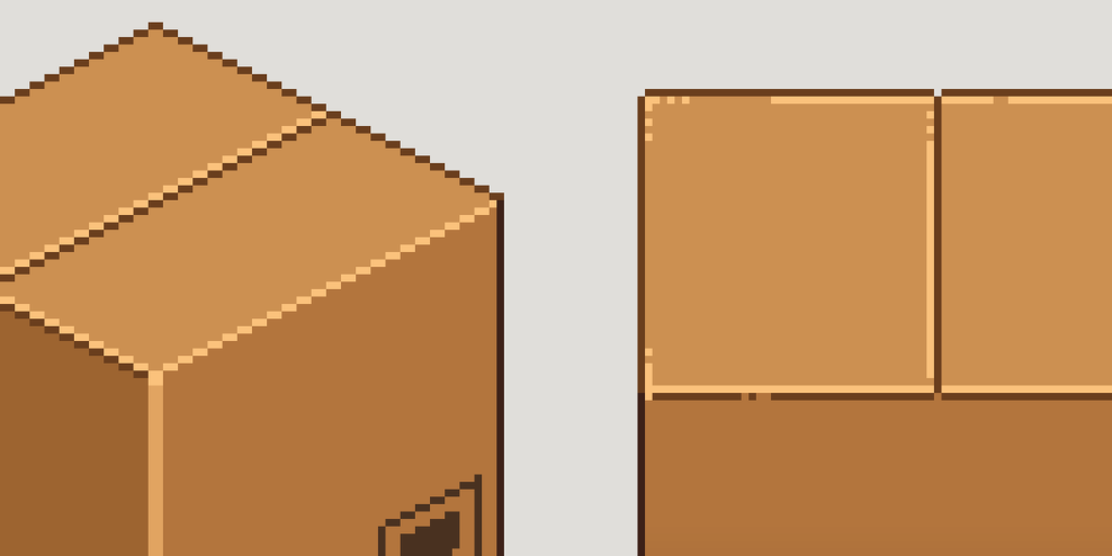
I started layering in other small details too. Symbols you’d expect to see printed on a cardboard box, an interpretation of tiny text on the medium box, tape, shadows and changes in the highlights. None of it is particularly complicated on its own. Underneath everything, these boxes are still just blocks.
They’re detailed blocks.
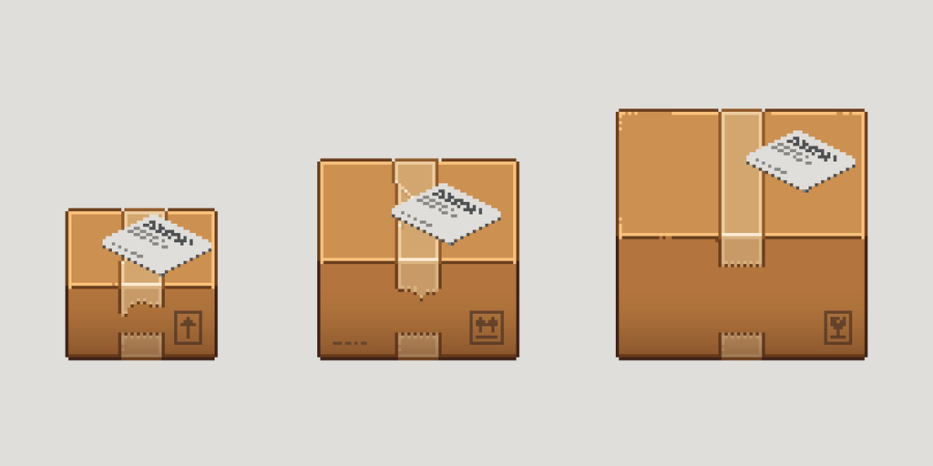
One habit that really helped throughout this process was keeping old versions. Once I get to a logical point in a design, I tend to preserve it. If I want to try something different, I’ll copy it, move across and work on a new version rather than drawing over what I already have.
That meant the file slowly filled up with boxes.
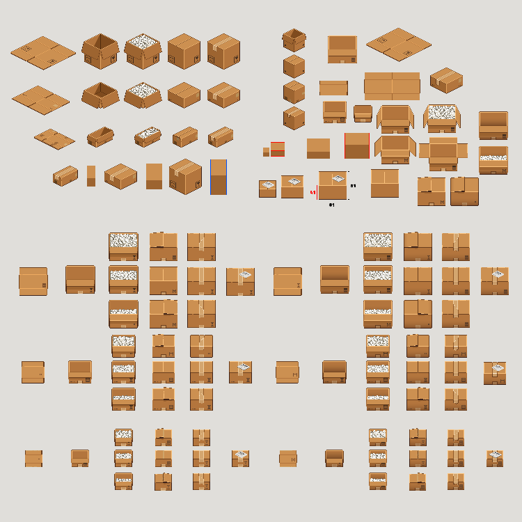
Different flap positions, different shadows, different highlights, different tape seams. Some worked better than others, but keeping them meant I could always look backwards. I could see what I’d already tried, compare ideas and, importantly, avoid losing something useful because the next experiment didn’t work.
I was also passing these versions over to Jamie throughout the process. I’d tell him where I was with them, what I didn’t like and what I wanted to explore next. Sometimes he’d agree that something wasn’t translating properly. Other times he’d challenge something I liked. It’s his game as much as it is mine, and we’re comfortable challenging each other when something isn’t working.
Eventually, something changed.
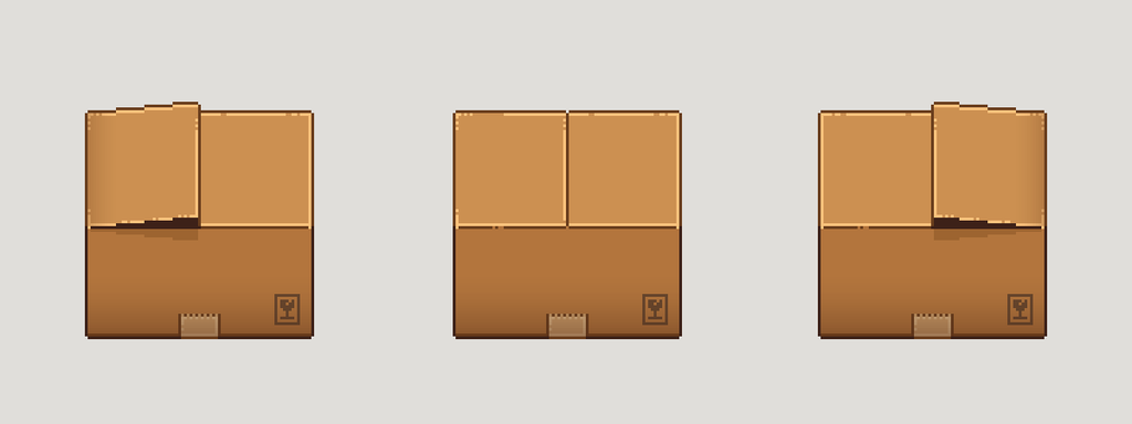
I’d saved the closed box state and, rather than trying to fix another problem, I started wondering what else I could do with it. I tried leaving one of the flaps partially open. It was really just an exploration piece to see what it would look like.
I liked it.
But then I thought that if every closed box had the same partially open flap, I’d eventually have exactly the same problem again. Instead of every box being perfectly closed, every box would now have the exact same imperfection.
So what if it wasn’t the default?
What if the player had a random chance of getting the normal closed box or one with a flap slightly open? I flipped the flap to the other side and suddenly I had three variations.
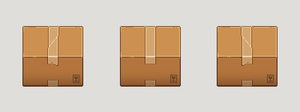
That immediately made me look at the tape differently. Every taped box had a perfectly straight piece of tape running across it, which now felt a little too perfect. I tried a less-perfect taped version, flipped that, and ended up with three taped variations too.
What started as me messing around with a flap had turned into something we could actually use. The game can choose between those variants, and because variation is now part of the system, we’re not limited to three forever. If I create another useful variation later, we can add it to the pool.
Earlier, I was experimenting because something wasn’t working. I was moving the flaps around, changing highlights and trying different shadows because I was frustrated and looking for an answer. Now I was experimenting because I wanted to see what else I could do.
The boxes weren’t perfect. There are still things I might revisit later, and that’s fine. But the core idea finally felt believable enough that I had stopped trying to repair it and started building on top of it.

Continue reading: Art Notes #05 – Designing the Peanut Dispenser
Mad that