

I’d already designed the computer once before, back when the game was working on a much larger canvas. That version was created in a very different way to how I’m working now. There wasn’t much structural planning behind it. I had an idea in my head, put the cursor to the canvas and kept drawing until I had something I liked.
For the new version, I already knew what the computer needed to do. It would be where the player receives emails, story beats and some of the progression through the game. Visually, I also had a fairly strong direction in mind. I’ve always liked the monitor design in Severance, particularly the way it feels like a piece of technology rather than just a screen attached to a box. I wanted to take some of that thinking and adapt it into the visual style I’d been building for Box Directive.
The difference this time was that I wasn’t starting with a blank canvas and hoping I’d eventually arrive somewhere good. I had rules.
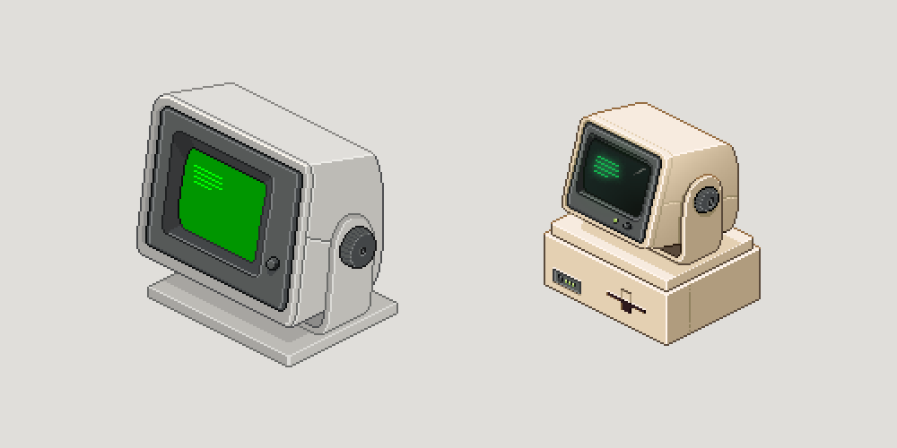
Building with restrictions
I’ve spent quite a lot of time creating a library of blocks, circles and construction guides. GARY was probably the first asset where that system really proved itself to me. He was made from lots of separate shapes that needed to sit together properly, rotate around believable points and still feel like one object.
By the time I got to the computer, I wasn’t questioning whether that system worked anymore. Instead, I was starting to combine different parts of it.
The monitor was always going to tilt. In my head, the large dial on the side would control the vertical angle, while the monitor and its arm would sit on another pivot in the base so the whole thing could swivel around. Whether the player ever actually needs to manipulate all of that isn’t particularly important. I wanted the design itself to suggest that it could.
That meant I couldn’t just tilt the screen until it looked roughly right and stop there. If the arm has thickness, the pivot needs to exist somewhere inside that depth. If the monitor rotates around that pivot, the centre points on the other faces need to move with it. Moving one part changes where something else needs to sit.
I enjoy that kind of restriction.
When I have no rules, I can just move things around until they look good. When I give myself a system, I have to start asking how the pieces actually interact with each other. Where does this connect? How thick would that arm be? If it has thickness, where would its centre really be? If the screen tilts, what happens to all the other points around it?
Those restrictions don’t make me feel less creative. If anything, I think they make me more creative because I have to find my way around them.
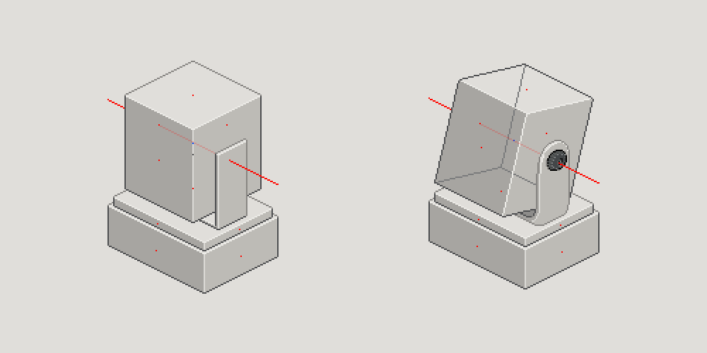
For the tilt, I tried using an isometric circle as a rough rotation blueprint. Unfortunately, I’d already decided that the monitor wasn’t going to be perfectly square, so there was still a fair amount of guesswork involved. The basic idea was that if one corner moved by a pixel around the circle, the other related points needed to move with it. Connecting those new positions together started to give me the same shape viewed at a different angle.
While working through it, I noticed that the depth and height were effectively following opposite pixel steps. Using horizontal movement first, a depth edge using a 3:1 step meant moving three pixels across for every one pixel up. The corresponding height edge then followed a 1:3 step, moving one pixel across for every three pixels up. The width, meanwhile, stayed locked to the existing 2:1 isometric grid.
It wasn’t a perfect mathematical rotation system, and because the monitor wasn’t a perfect cube I still had to make adjustments by eye. But the guides gave me a logical starting point rather than just moving pixels around until something looked right.
Fewer pixels, more decisions
The new computer is quite a bit smaller than my original design, and I think that actually helped it become a better piece.
At the larger scale I had more room to add detail. With the smaller version, every pixel needed to earn its place. There wasn’t enough space to casually add another line or another bit of shading just because it looked nice. Form, light and shadow had to do more of the work.
The hardest part was the depth around the screen. There are several steps before you even reach the CRT itself. You have the outer casing, the bezel, the grey inner area and then the recessed screen. On top of that, the screen itself needed to feel slightly curved.
It probably doesn’t look particularly dramatic in the progress images, but there was a lot of back and forth trying to get those layers to read properly. At this size, shifting or changing one pixel can make a recess disappear completely, or suddenly make another one look much deeper than it should.
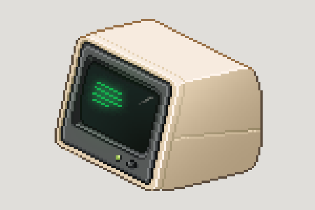
Manual anti-aliasing became important here too, although I had to be careful with it. A few times I went too far and ended up undoing the work because I’d started smoothing out more than I intended.
I like zooming in and out while I’m working. I could keep another window open at 100% and use that as a constant reference, but I prefer physically moving between the different zoom levels. It feels like I’m checking the asset at several distances in one motion.
Eventually I stopped thinking about anti-aliasing as something I needed to apply to an entire edge. I was just looking for the individual pixel making a line feel too harsh. Sometimes lightening or darkening that one pixel was enough.
The computer base was much easier. I always knew it would essentially be a block, so most of the thinking there was about the details. A switch, some status lights and somewhere for a floppy disk gave me enough to make it feel like an 80s computer without overcomplicating it. There was plenty of real-world reference around for that, so once I found something that suited the monitor it came together fairly quickly.
I forgot the mouse
Completely.
It didn’t cross my mind until I’d put the finished computer into the actual workstation and started moving my cursor around, imagining how the game would play. I was mentally clicking the different machines and running through their interactions, then I got to the computer.
In my head, the screen would take over and the player would navigate through their emails and whatever else eventually lives there.
Then it dawned on me that I hadn’t given them any way to actually do that.
I considered a keyboard, but it felt needlessly clunky and would take up quite a lot of the desk for very little benefit. At the moment I’m entertaining the idea that the player uses a keyboard when they first enter their name and set up their login, then it gets taken away afterwards. Maybe the company doesn’t want you communicating with anyone. Maybe they only want you receiving instructions.
Or maybe I just didn’t want to draw a keyboard and overcrowd the workstation.
Either works.
The mouse itself was simple, basically another little block with a single button. We have talked about possibly letting the player physically move it around the desk, with the cable acting almost like a bungee cord that pulls it back into position when they let go. It would be a completely unnecessary little interaction, but I quite like those kinds of things. Whether it survives the first pass will depend on how awkward it is to actually implement.
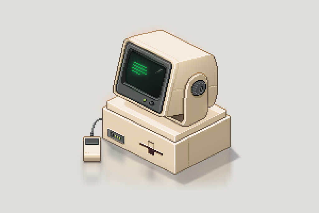
Turning the green down
The last major change was the screen itself.
My original version was very green. Bright, vibrant, in-your-face green. When I first designed the monitor in isolation I quite liked it, but once it was sitting in the full workstation it became obvious how much attention it was pulling away from everything else.
Your eye went straight to it.
That wasn’t what I wanted. Most of the time the computer is just another part of the workstation. It needs to come alive when there’s an email or a story beat, but it shouldn’t constantly compete with the box and the machines around it.
I did some more research into old CRT monitors and found that the displays were generally much darker than the version I’d originally made. I pulled the green back considerably, while still keeping the displayed pixels slightly exaggerated so they had enough character at this resolution.
The idle state doesn’t really display readable text. There aren’t enough pixels for that. It’s just a few single-pixel rows using the same 2:1 stepping as the rest of the art, with one pixel blinking at the end. It’s enough movement to give an otherwise static object a little bit of life. When an important story email arrives, that can be replaced by a much larger email icon so the player knows something is waiting for them.
The full-screen interface is another problem for another day. At the moment we’re just working out what information needs to exist there. Once we’ve established that, I can start properly thinking about the UX and UI of the screen takeover.
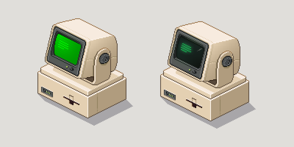
Darkening the screen was the final piece that made the computer feel finished to me.
It’s still essentially a collection of blocks. Most things I’ve built are. But moving the monitor away from the usual 2:1-facing angle gave it far more character than another machine pointed squarely towards the player.
That’s probably what I like most about it.
The rules and construction guides gave me the confidence to break away from the normal angle without feeling like I was just guessing. The smaller resolution forced me to think harder about every pixel, and the physical logic behind the pivots gave the whole thing a bit more believability.
The original computer was something I drew until it looked good.
This one feels designed.
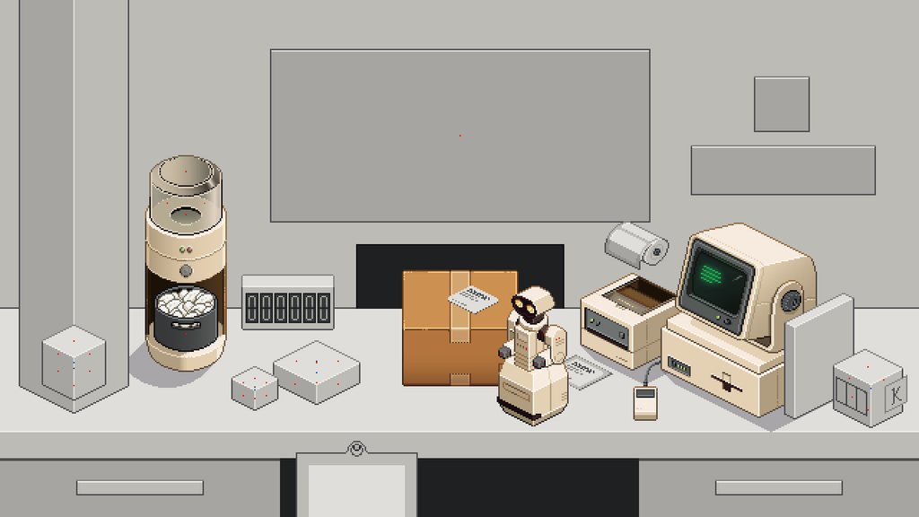
Am I overthinking this, but the mouse being on the left hand side doesn’t seem natural to me?