

Start with what the machine actually needs to do
When I sat down to start the label printer, I wanted to set myself some guidelines. I didn’t want to head into the dark with no light, so to speak. I wanted the label printer to be believable, so that users knew what it was when they looked at it, and I wanted the design to feel simple and intentional.
So I started by writing down what the basics of a label printer would be. This had to be the first step if it was going to feel believable.
First, what objects are needed? The consumable label roll, a single label, and the printer itself. Check.
The consumable needs to be inside the machine, so the machine has to be bigger than the roll. So I looked at my scene, took out the roll and the machine, and made sure they fit. They did. Check.

Then I needed to think about what the printer actually needed. A button? Lights to indicate the printer is empty? A light to show the user that it’s printing? A way for the printer to release the printed label?
Next, I cross-referenced everything with our gameplay document, where we go into more detail about what the player needs to do at each machine level. For this first pass I was only designing Level 1, but that doesn’t mean I wasn’t thinking ahead to what could come later.
We decided the L1 printer would work like this: the player clicks the printer to activate it, then clicks and drags the printed label onto the box. Simple.
That all sounded fine, until I started questioning one of my earlier decisions.
The switch that didn’t make sense
Originally, I thought the printer should have a power switch. But the more that sat with me, the more it bothered me.
Why would the player be turning the printer on just to print a label? In real terms, you’d then have to wait for it to power up, receive the data, and then start printing. If the printer had no power, how would any of the lights even work if it was empty?
The more I thought about it, the more I realised the original plan didn’t work in real life.
A switch-style control implies a power state – on or off. That wasn’t what I wanted to represent. What I actually needed was an action. So I changed direction and made it a button instead: push to dispense.
That worked much better, because it aligned with both the gameplay and the machine. In game, the player clicks the machine. In-world, that translates neatly into pressing a button to start printing.
And it also gave me a way to think about the later levels. If the player no longer needs to click the printer in later upgrades, then that interaction element can disappear or change too. The machine can evolve as its function changes.
So in the end, that became the guiding idea: it had to be functional and believable.
Designing from the smallest part outward
One of the biggest lessons from this machine was that I needed to design from the smallest dependent part outward.
In this case, that meant starting with the label itself, then the label roll, then the printer mouth, and only then the printer body.
However, in true ‘Andy’ fashion, I actually designed the consumable label roll first, completely ignoring my own advice. I didn’t go completely off the rails though. The block-out for the roll was still built from the dimensions of the printed label, using a single face for the label itself and a box based around those measurements.
I did it this way because the machine was ultimately dependent on the roll, and I wanted the roll to visually communicate what it actually was. If I’d designed the printer first, I would have ended up forcing the label roll to fit whatever space I’d already given it, rather than letting the consumable define the dimensions the machine needed.
But I also had to think about the actual single label, and how that would work. That label needed to come out of the mouth of the printer, so there were a lot of dependencies happening all at once.
The concept was fairly simple: it was a roll, so finding the right cylinder from the shape system I’d already built was pretty easy. I also wanted to communicate that it had an end to it – that it wasn’t wound up perfectly tight, but felt a little more natural, with it starting to unravel slightly.
That got me quite excited, because it let me use one of the larger isometric circles to show the outer edge starting to peel away.
Initially, I perforated the labels, but something wasn’t quite right. Then it clicked that I needed to represent both the label and the backing paper, so it looked like something that could be peeled off and stuck onto a box.

So I designed a second version based on the first, but with individual labels separated by small gaps, so you could read the backing material underneath. I sent a screenshot to Jamie and we both immediately thought the first version now looked like toilet paper when the two were side by side.
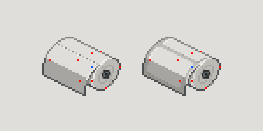
So that made the decision for me.
Finding the shape of the printer
Once I knew what the machine needed to do, and what the consumable looked like, I had to answer the next obvious question:
What should this thing actually look like?
Not in a whimsical, open-ended way. More in a very honest, I have no idea where to start kind of way.
So I looked around for inspiration, then just put cursor to canvas and started throwing ideas down. My first attempt kept the overall shape of the original block and added some details, but it ended up looking like the elemental stones from The Fifth Element.
I then tried adding a slope, but whether it was too shallow, or whether the printer mouth changed how it read, it started looking a bit like an alligator.
I didn’t like that.
So I kept going. A little research, then a little design, back and forth.
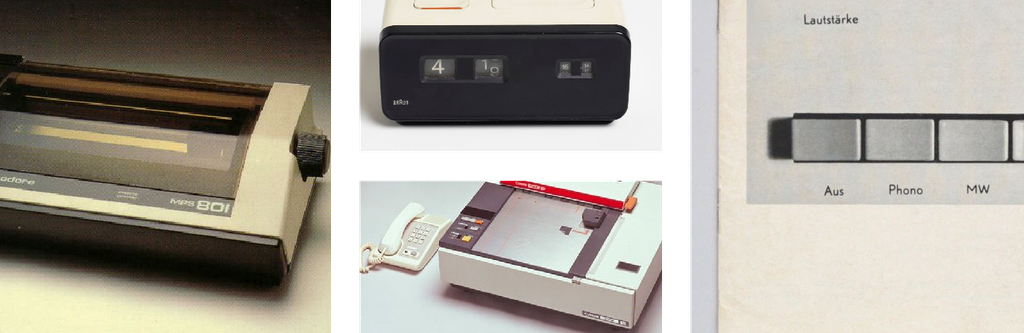
The box shape eventually came back, because as much as I was trying to get away from the blockiness, most of the printer references I was looking at were, ultimately, still blocks. Once I accepted that, the design started feeling more honest.
So I leaned into it.

That also suited Level 1 really well. I want the lower-level machines to feel a bit more clunky, more blocky, and more like slightly awkward 80s technology. Not badly designed, just more basic.
From there, I added a front interaction area, and that immediately felt better.
I was showing the design to Jamie, and he suggested a see-through brownish plastic cover so you could see the roll inside. I found a reference and tried it out, and by the end I thought it looked really good. It gave the machine a bit more character than just another solid plastic box.

Designing for interaction, not just appearance
As I worked through the printer, I kept thinking ahead to animation.
That’s been important in a lot of this project so far: not just asking what does it look like?, but also how will it move? and how will the player interact with it?
That was particularly important when I started looking at the open state of the printer.
The most important thing for me there was the proportions. If I got the hinge mechanism or pivot point wrong now, I’d only have to redo it later once I got to the animation pass. So while exploring the open state, I was really thinking about isometric circles, block rotation, and how the lid would move on a believable pivot.
The flap needs to look correct and also move correctly.
There’s a lot we can do later to show the player how to use consumables – outlines, highlighting, little animations to indicate where something should go – but from a design point of view, I wanted the object itself to make sense first.
Small details that make it feel real
I’m still tweaking small parts of the printer, and I think those little tweaks are often where a design either starts to feel believable, or falls apart.
For example, while I was exploring the pivot and lid position, I suddenly thought: how would someone actually open this lid?
Would they just put their fingers directly on the brown plastic and pull it open?
If so, that would leave oily finger marks all over the clear plastic, which didn’t feel quite right.
So I added a small recess into the off-white casing so you could get your fingers in there and open the lid without smudging the plastic. It’s only a tiny change, but it made the design feel much more intentional.
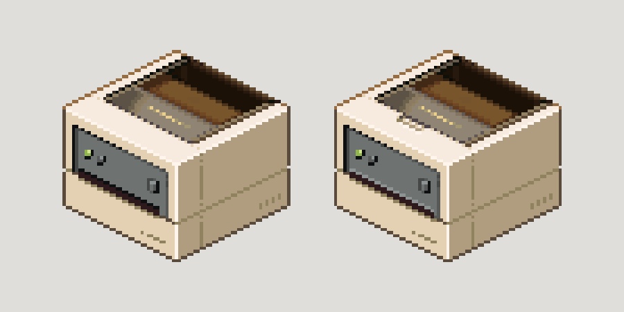
I also ended up adding an extra pixel line on the printer mouth, because it just didn’t read correctly without it. Pixel art often comes down to tiny decisions like that – one pixel can be the difference between something feeling right or not.
What this establishes for the rest of the machines
One thing I do like about the final L1 printer is that it’s helping establish what the wider machine language for Box Directive should be.
The warm off-white body colour came out of refining and creating GARY, and that has now carried over to the printer and the other machines. I like the functionality of the design, and I feel like it’s believable, but the brown transparent lid adds something slightly different so it isn’t just another off-white plastic box.
More broadly, I think this machine has reinforced a few useful rules for me:
- Lean into the blockiness of the technology.
- Gather references, explore, and ask for feedback.
- Stay grounded in what is functional and what is genuinely needed for this machine to work.
- Design from the smallest dependent part outward so everything stays consistent and believable.
That last one is probably the biggest takeaway from this whole printer exercise.
What’s next?
After the printer, I want to work on the small, medium, and large boxes in all of their main states:
- flat
- built
- packed
- taped
That will give me another important set of core assets for the game, and because they’re so central to the whole premise, I want to make sure they’re handled properly.
For now though, I’m happy with where the Level 1 label printer has landed. It started with a lot of uncertainty, but by breaking it down into its smallest parts and thinking through what the player actually needs to do, I feel like I’ve ended up with something that fits both the world and the gameplay.
And, importantly, it looks like a label printer rather than a toilet roll holder or a small alligator.
Continue reading: Art Notes #04 – Finding the Box
Honestly bonkers this ! My head’s gone haha