
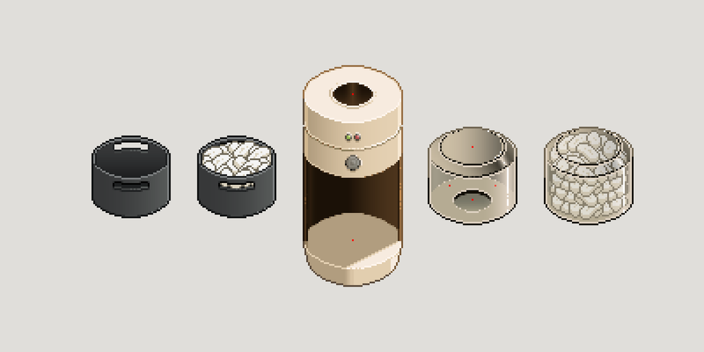
When I started the peanut dispenser, I already knew I wanted it to do something the rest of the workstation wasn’t doing. A lot of the scene was becoming quite blocky. The label printer was blocky, GARY was mostly built from blocks, and even the boxes themselves were obviously boxes. I wanted something taller and more cylindrical on the left-hand side to break that up a bit.
The initial idea came from one of those bullet-style food blenders. They have a removable container on top, a button to start them, and whatever you put in eventually comes out underneath. It felt like a surprisingly useful reference. We needed somewhere visible to store the packing peanuts, the removable top gave me an obvious consumable area, and the manual start button fitted with how I was already thinking about Level 1 machines.
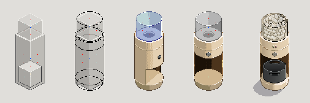
That gave me the overall shape. The next problem was getting the tray in and out.
A satisfying clunk
The tray idea came from our Ninja air fryer. There is something satisfying about the way the drawer slides back into the machine and gives you that solid clunk when it reaches the end. I wanted something similar here. The player would be able to remove the tray, use the peanuts, then slide it back into the dispenser.
My first version had the tray entering at an angle. Because the dispenser sits on the left of the workstation, I also wanted it pointing towards the middle. I’ve been trying, where I can, to have things lead the player’s eye towards the box. That’s the main focus of the game, so having the machinery subtly point towards it felt like a good underlying rule.
The problem was that the angled opening made the interaction awkward. The tray needed to disappear behind both the top and the side of the dispenser as it moved inwards. I could probably have masked it in Godot, or split the machine into several sprites and layered them around the tray, but neither option really appealed to me. I’ve seen enough tiny seams appear between sprites when engines render things slightly differently to be wary of chopping an asset up unless I actually need to.
So I redesigned the opening instead, moving it to a straight-on view and opening up more of the front. I left enough of the sides in place that the base still felt structurally believable, but it gave the tray a much cleaner path in and out of the machine. More importantly, it meant I could keep the dispenser as one sprite, with the tray moving independently in front of it.
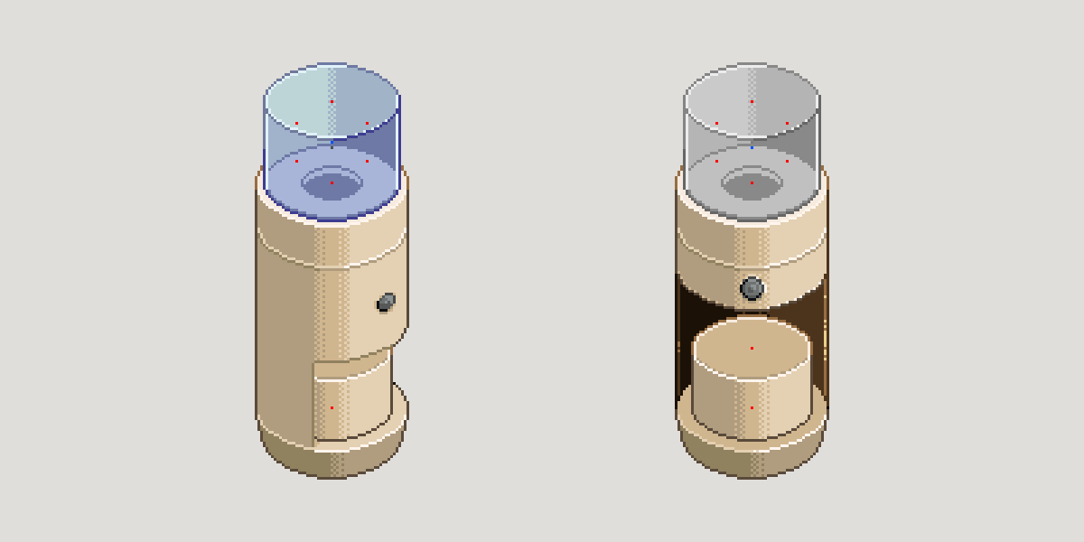
It was a compromise. The machine no longer pointed towards the box in the way I’d originally intended, and at first it felt flatter because I’d lost that extra angle. I’d already run into something similar while designing the boxes, where moving towards a straighter view meant losing some of the depth cues I’d expected. Because the dispenser was cylindrical, it didn’t have the same strong depth lines as the more rectangular machines. You can tell it’s facing forwards, but it doesn’t feel particularly jarring. The interaction worked better, and visually I could live with the trade-off.
That problem was solved, but it exposed the next one. I now had to make the thing actually look round.
When the palette stopped helping
Up until this point I’d been using roughly the same palette I’d developed across GARY and the label printer. That had worked well because both are mostly made from flat surfaces. A fairly hard jump between shades can make sense when light moves from one flat face to another.
On the peanut dispenser, those same jumps started looking like bands. Instead of reading as a smooth cylinder, it looked like the machine had been built from several flat faces wrapped around each other.
My first thought was dithering. I tried using the two harsher colours I already had and manually mixing the pixels between them to soften the transition. It was a sensible thing to try, and dithering is obviously a well-established pixel-art technique. It just wasn’t working for this asset and the style I was building.
The colour difference was still too large, so the transition remained obvious. When I tried to dial the dithering back, the pattern started feeling too rigid and systematic. I could see the technique rather than just seeing the form. It wasn’t the nice, deliberately clunky 80s machinery I’d been aiming for. It felt forced.
Then I had a thought.
I wouldn’t have this issue with a proper gradient.
That was slightly inconvenient, because for years I’d convinced myself that using gradients in pixel art was somehow cheating.
A rule nobody gave me
Nobody had ever actually told me I wasn’t allowed to use gradients. It was just something I’d decided somewhere along the way. I think I’d built up this idea that if I wasn’t personally placing every transition by hand, then it somehow wasn’t proper pixel art anymore.
I made a gradient version anyway and put it next to the dithered one, then sent both to Jamie for a temperature check. Dithered version on the left, gradient version on the right. He picked the right one.
When I explained why I was hesitant about gradients, he said:
“Also it’s your art style so you can do anything that looks good and works.”
There was another comment along the lines of, “show me something great and I’ll pick great.” That was probably all I needed to hear. It helped break the illusion I’d built for myself. It’s my art, and if something looks better and still fits the game, why wouldn’t I use it?
I’m probably making that sound more profound than it needs to be, but challenging an idea I’d held for years and then finally doing the thing I’d decided I shouldn’t do did feel freeing.
It also sent me back looking at pixel art I already liked. I’ve owned and played Sea of Stars for a while, and I’ve loved its graphics since I first saw a gameplay trailer. I remember spending time just walking around because I wanted to look at the world rather than progress the story. Barrels, ropes, rocks, little background objects, everything just felt incredibly clean.
It was only when I started looking at it more closely for reference that I noticed some of the subtle gradients being used. I’d been enjoying the result for ages without ever stopping to question whether those techniques fitted whatever rules I’d invented for pixel art in my own head.
That didn’t mean I suddenly wanted to put gradients everywhere. If anything, I needed a better rule to replace the old one: a gradient should add to the art, not be the art. If you notice the gradient first, I’ve probably overdone it. That feels much more useful.
Trying to make glass
The hopper on top of the dispenser made the gradient question even more useful because it needed to look transparent. This was another thing I hadn’t really done before, and I struggled to find pixel-art references that matched the size and shape I was working with.
Eventually I stopped restricting the search to pixel art and started looking at printed adverts from the 80s instead. I found an advert for drinking glasses and used that as a reference for how highlights, darker edges and transparency were being suggested.
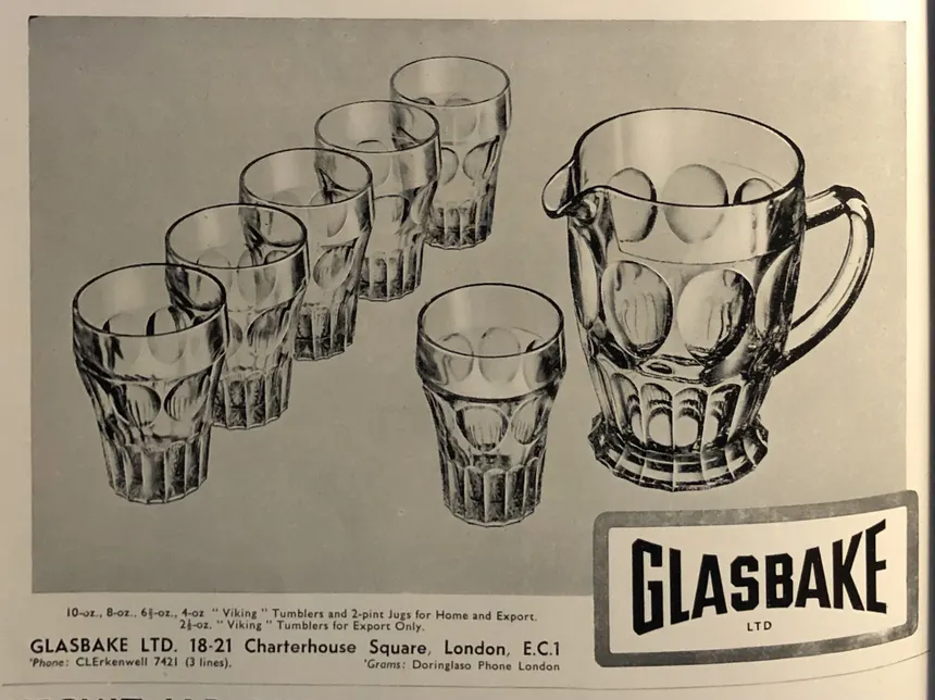
I didn’t suddenly discover some clever glass formula. I approached it in the same way I tend to approach most things I don’t know how to do. I brute-force it. Or, if I want to make that sound slightly more respectable, I keep trying things until something sticks.
I know that if I persist with something for long enough, I’ll normally get to a point where I can make it work. I’m happy with where the hopper ended up because it reads as glass to me, which was the important thing. It’s also one of those assets I might come back to during the polish stage. By then I’ll have spent months making more artwork, so it’ll be interesting to see whether I can revisit it and do a noticeably better job.
Once the glass was working, I made the peanuts inside modular so I wasn’t locked into one set of fill levels. The contents could move up and down independently, while another transparent layer over the top helped tint them with the colours of the hopper. I then brought the strongest highlights and shadows back over everything. That was enough to make the peanuts feel like they were actually inside the container rather than pasted on top of it.
The moment the whole machine clicked was when I put that newly designed hopper onto the dispenser for the first time. It was the first point where all the separate decisions felt like they belonged to the same object. I liked it, so I immediately fired it over to Jamie.
Back into the workstation
The tray still needed finishing. My first proper attempt somehow looked like a coffee mug, so I went back to the drawing board and turned it into a dark grey hard-plastic shell instead. Apart from no longer looking like something you’d drink out of, the darker colour gave the machine some useful contrast and made the light packing peanuts easier to read inside it.
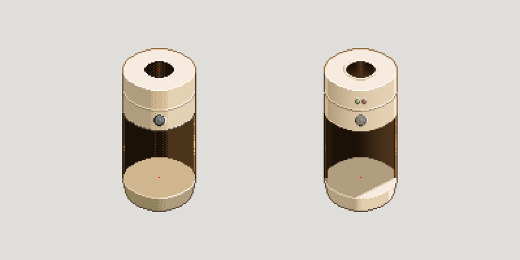
From there, the controls were fairly straightforward. Level 1 machines are starting to develop a consistent visual language: two separate LEDs, one for active and one for error, and a physical button because the player is still operating the machinery manually. Those details are becoming part of how I’m distinguishing the different machine levels, rather than something I want to redesign from scratch every time.
Putting the finished dispenser into the workstation finally started balancing the scene as well. I’d built the label printer on the right first, and GARY was also just chilling over there, so a lot of the visual weight had ended up on that side. The tall cylindrical dispenser gave the left something more substantial and started bringing everything together.
It also had a knock-on effect beyond this one asset. Once I’d got comfortable with the gradients here, I went back and applied some of what I’d learnt to the boxes. Because I’m currently making the artwork faster than I’m writing these posts, you’ll actually see those refined boxes in the previous Art Notes before reading the thing that caused me to rethink them.
That’s probably just going to be part of writing these while the game is moving this quickly. The posts can follow the story of an asset even if the exact production timeline has already moved on.
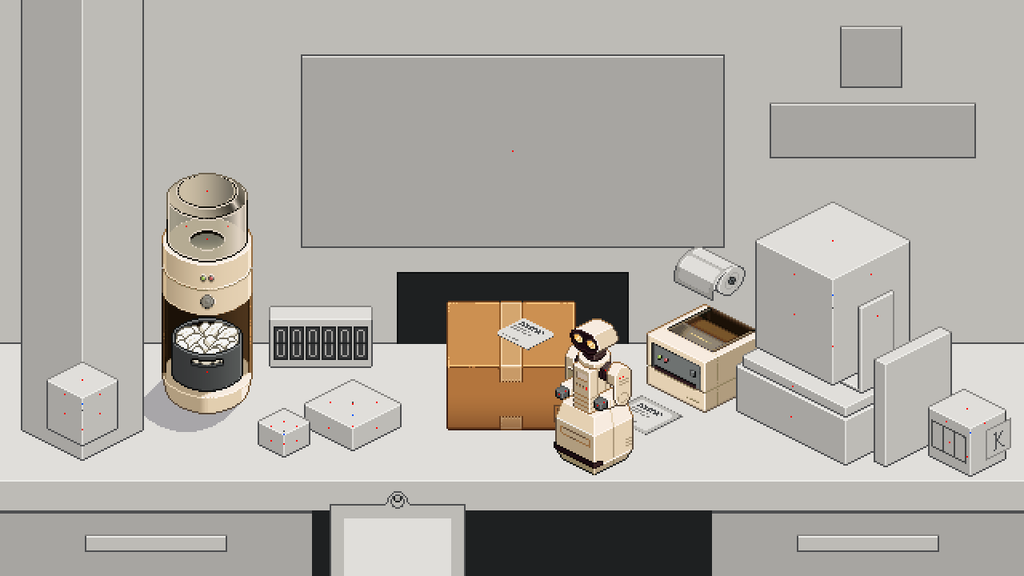
I did sit there for a little while afterwards just enjoying the scene coming together. I’m nearly always thinking about what could be improved or what I should build next, which is probably why I ended up going back to the boxes rather than leaving the gradient experiment here.
I’ve also realised that if I sit there looking at the scene for too long, that’s normally my signal that I’m done for the night. I don’t have enough energy left to start changing it again.
Continue reading: Art Notes #06 – Designing the Computer
Comments (0)